...
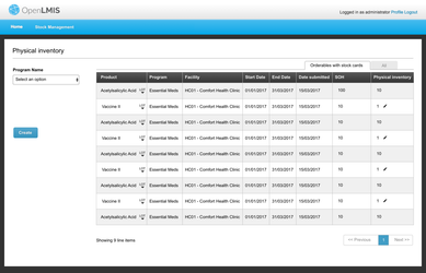
After you click the 'create' button:
Feedback from Team ILL:
- The top progress bar might be confusing to users; maybe a text explanation sentence for users would help.
- Regarding the "All" tab, we suggest an alternative idea: put an "Add" button on the page instead of the two tabs. Clicking the "Add" button brings up a modal/popup with a Product field to pick product(s) to Add, or Cancel to close the modal/popup. When you click add, the modal/popup closes and the table reloads with the additional product(s) shown.
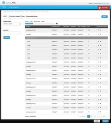
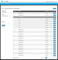
- Regarding the "Lot" dropdown, we suggest doing something visually to distinguish the lot names (Lot A, Lot B, etc) from the Product name (Acetacylic Acid, etc). EG, that could be a slight indent. For the Lot rows we might want to show the Expiration Date, not repeating the Program or Facility column. Nick has an idea that he might share with Mary Jo first. Finally, the Lot expand/collapse could be removed, and we just show all the lots (with no ability to collapse the lots).
- We suggest removing the use of the Pencil icon. All the editable fields can be an editable bubble field. We don't want users to have to make an extra click on a Pencil icon whenever they want to add a number.
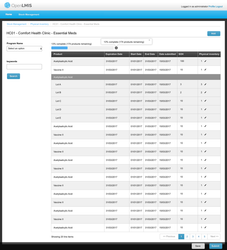
- Columns for Program and Facility might not be needed because those are in the page title.
- We suggest grouping these rows by Product Category, or possibly by CommodityType (Josh may have input about how we group by Commodity Types when TradeItems are in multiple CommodityTypes in different classification systems). The Product Category groupings are used on the Requisition Form and help staff to work through their products in a group. Products are alphabetical within each category.
- Regarding the "Back" button, we suggest moving that. We don't have a specific page the user should go 'back' to for now. We don't use the 'back' button as a pattern in OpenLMIS UI so far.
- Regarding the "Save" and "Submit" buttons that are both blue, we suggest moving Save to the left-hand side and making it gray instead of blue (similar to the pattern on the Requisition screen). The "Submit" button is the primary action, so it would stay at the bottom right in Blue color.
- Looking Forward: Once we have built out Adjustment feature (in 3.1 stock scope), we want to add a link to the Adjustment screen from this Physical Inventory screen. While doing the Physical Inventory, a user might want to jump in to make an adjustment for any product, so an action link or action button for that on each product row might be helpful.
If you click 'Add' button in order to make a physical inventory for those orderables do not have stock cards yet:
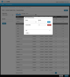
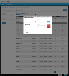
You can search with keywords:
Feedback from Team ILL:
...
After you click 'save' button:
If the save failed then:
Feedback from Team ILL: The styles for the red error message here have changed recently. Please use the latest UI Style Guide when you code this.
If you go back and want to view you saved draft then, You can click the 'create' button to edit the draft
Feedback from Team ILL: We do not need the "view mode" screen here to show you the view-only draft first. When the user goes into the draft inventory, they can go directly into "editing mode". Also, this screen should have the progress bar at the top.
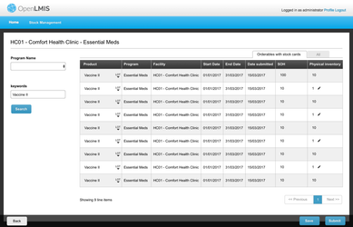
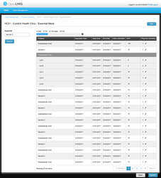
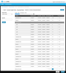
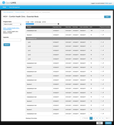
After you submit a physical inventory then it will navigate you back to the SOH summary page with the program you choose for the submitted physical inventory and your home facility:
Feedback from Team ILL:
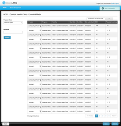
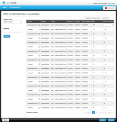
- We suggest just showing all the Lots in this table rather than collapsing the Lots with the expand/collapse feature.
- We suggest taking off the Program and Facility fields and the left "View" button here. The Program and Facility are included in the page title, so that is fine. And this solves the problem of having two kinds of "View" buttons that each do different tasks.
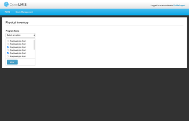
The design for allowing user to choose multi-programs for one physical inventory:
The physical inventory page include lot information:, already covered above
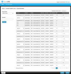
Feedback from Team ILL: Similar to above, for now we can show all the Lots expanded and not include the expand/collapse feature. Also we will need to handle the Lots in the pagination (we talked about ideas to avoid having some of the Lots paginate and get split up on separate pages).
...
In this workflow, a Store Manager is checking the stock level for a commodity in a facility.
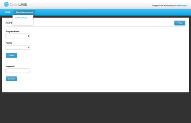
SOH menu:
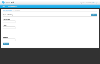
After you choose a program, facility and then click the 'view' button then:
The SOH summary view within lot information:
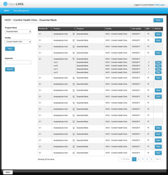
Feedback from Team ILL:
...
If you click the 'view' button next to one orderable, then it will direct you to the stock card page:
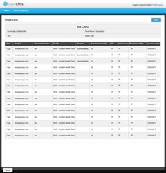
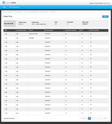
Feedback from Team ILL:
...