...
| Process | Ideal View | Notes |
|---|---|---|
| visual / at a glance should illuminate the RISK right away | |
| 2. What data is driving that state? | Drill-down ability from step above | |
| 3. Where should I focus? | Ideas:
| |
| 4. How can I improve that? What questions do I ask? | static , suggested RCA questions to ask at the bottom Vidya Sampath could you clarify this a bit more? I couldn't read you hand writing and want to make sure I'm clear. Perhaps an example or two to provide the RCA probes for each indicator | New: Mary Jo Kochendorfer (Deactivated) - I thought about this after our meeting – but another cool option to have in this dashboard is note-keeping – in that the user is able to jot down the top 2-3 changes that her/his team has decided to implement as a result of data review and analysis from this dashboard. Would it be possible for the dashboard to have a notes section which also gives people ability to put some dates and "@" tags for tasks to other users? |
.jpg?version=1&modificationDate=1518568994754&cacheVersion=1&api=v2&height=250)
Positive Performance Approach
Vidya Sampath to insert details on what defines 'good performance'.
Star Performers / Soccer League Style idea moving from relegation to premier to back
Separate dashboard for this; super nascent idea stage ; to be updated
Full stock availability
Clay Crosby (Unlicensed) and Vidya Sampath I've created this page to track the discussions on how best to visualize the FSA indicator
Important notes about full stock availability :
- Real value comes in looking at the indicator by facility types (all health facilities or all district stores or all regional stores etc).
| Process | Ideal View | Idea | Notes |
|---|---|---|---|
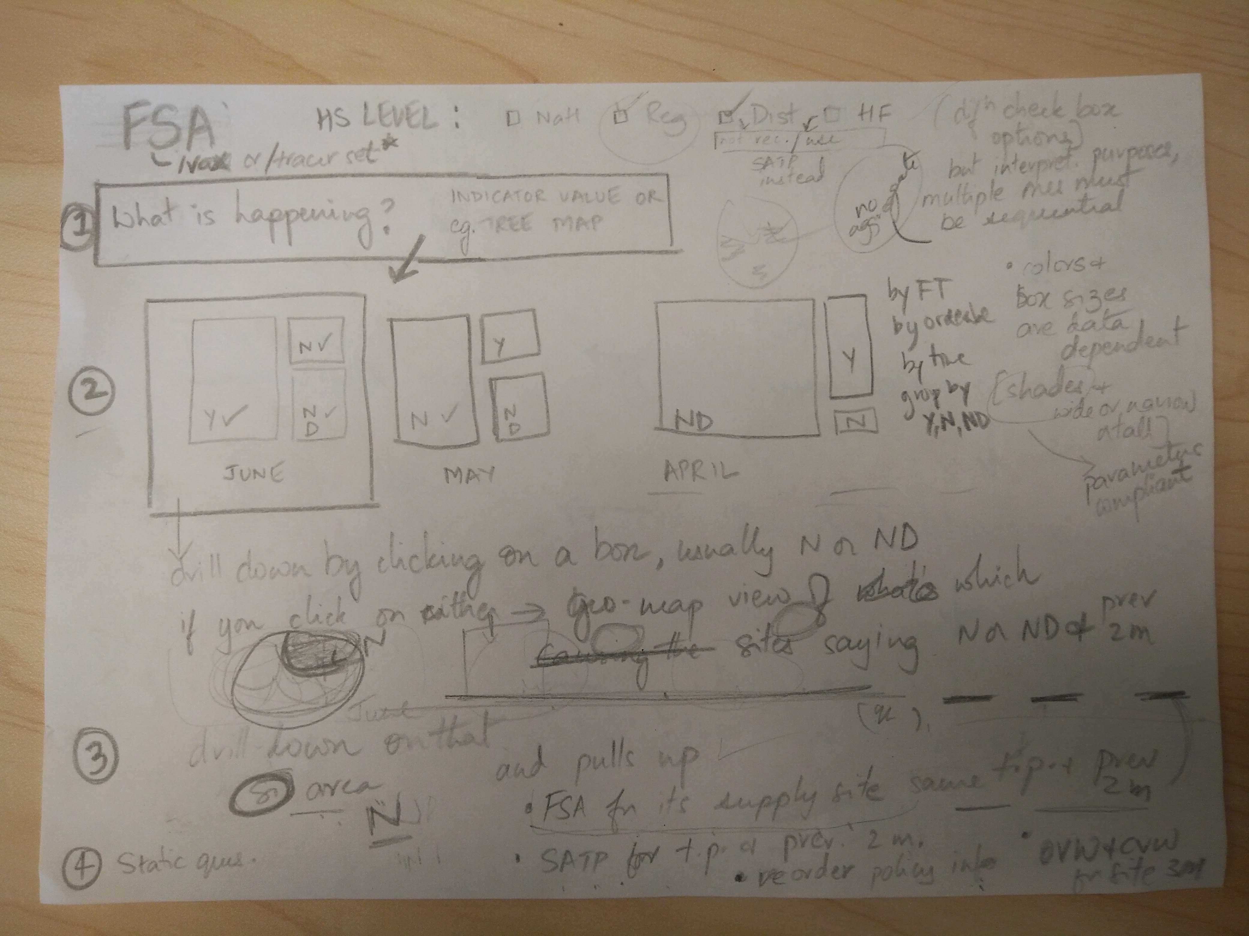
| visual / at a glance should illuminate the RISK right away | Idea: Start with a Tree Map View Groupings for the Tree Map View
Filter the Tree Map view by
Idea: Perhaps we lead with a bar chart to show which antigens have There is too much noise if a user selects several antigens and so the bulk of the tree map ends up showing "No" and "No Data" and over-plays the risk as a result. One way to work around this is to display either a simple bar chart which shows antigens with the highest number of sites with FSA = no stockno stock or a bubble plot showing 3 variables (antigen, # of sites, # of days out of stock) | |
| 2. What data is driving that state? | Drill-down ability from step above | See which sites are When you click on a box in the tree map in Step 1 above, it shows you the data that is contributing to the box. This data can be visualized in the form of a geo-spatial map. Let's say you selected the "No/Stockouts" box in the tree map in Step 1. When you select it, it then shows you a map that highlights the stocked out areas that contributed to the "No" box for the tree map. Key is to be able to see the 'worst offenders' over time (multiple tree maps potentially) Every single month (of the selected time period) that facility was a no means they are the biggest concernby seeing the drill-down for the selected time period, and the visualization for the two previous time periods to pull out patterns of performance. This gives the user the opportunity in Step 3 below to "Focus" in further. | |
| 3. Where should I focus? | Ideas:
| When at the site view: Show the following:
| |
| 4. How can I improve that? What questions do I ask? What corrective actions should we take? | static , suggested RCA questions to ask at the bottom Vidya Sampath could you clarify this a bit more? I couldn't read you hand writing and want to make sure I'm clear. Perhaps an example or two to provide the RCA probes and action suggestions for each indicator | Static questions for FSA RCA:
| |
- FSA of the supplying site for the most problematic facilities (for the same time-period and further back)
- Pull in other indicators for that site (Stock according to Plan, CVW)
- Re-order information with use information
Hand written notes