Table of Contents
Physical Inventory Workflow
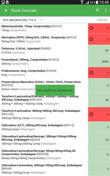
In this workflow a Stockroom Clerk is conducting a stock count of the commodities in a facility for a specific program.
| Gliffy | ||||||
|---|---|---|---|---|---|---|
|
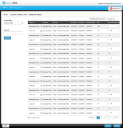
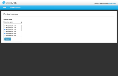
Choose a program for creating a new physical inventory:
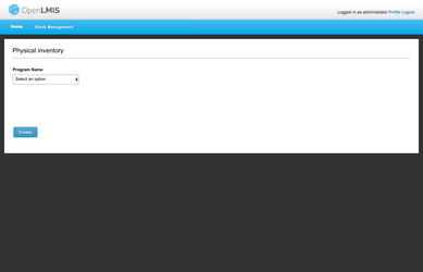
Feedback from Team ILL: In the future we suggest this screen might be combined with the Physical Inventory List screen to view any physical inventories that are already started in draft. That list ticket is not in the current scope. So far now there is not a list of any inventories in progress (fine for getting started now).
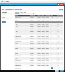
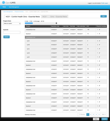
After you click the 'create' button:
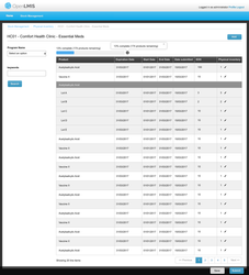
Feedback from Team ILL:
- The top progress bar might be confusing to users; maybe a text explanation sentence for users would help.
- Regarding the "All" tab, we suggest an alternative idea: put an "Add" button on the page instead of the two tabs. Clicking the "Add" button brings up a modal/popup with a Product field to pick product(s) to Add, or Cancel to close the modal/popup. When you click add, the modal/popup closes and the table reloads with the additional product(s) shown.
- New Comment: There is a Program dropdown still at the top left here. I believe we do not need that. We are not providing the option (yet) for doing an inventory on more than one Program at a time. Later if that feature is added, we may provide this field as a way to filter the grid of Products to limit it to a chosen Program. But I believe that is not in scope yet.
- Regarding the "Lot" dropdown, we suggest doing something visually to distinguish the lot names (Lot A, Lot B, etc) from the Product name (Acetacylic Acid, etc). EG, that could be a slight indent. For the Lot rows we might want to show the Expiration Date, not repeating the Program or Facility column. Nick has an idea that he might share with Mary Jo first. Finally, the Lot expand/collapse could be removed, and we just show all the lots (with no ability to collapse the lots).
- We suggest removing the use of the Pencil icon. All the editable fields can be an editable bubble field. We don't want users to have to make an extra click on a Pencil icon whenever they want to add a number.
- Columns for Program and Facility might not be needed because those are in the page title.
- We suggest grouping these rows by Product Category, or possibly by CommodityType (Josh may have input about how we group by Commodity Types when TradeItems are in multiple CommodityTypes in different classification systems). The Product Category groupings are used on the Requisition Form and help staff to work through their products in a group. Products are alphabetical within each category.
- Regarding the "Back" button, we suggest moving that. We don't have a specific page the user should go 'back' to for now. We don't use the 'back' button as a pattern in OpenLMIS UI so far.
- Regarding the "Save" and "Submit" buttons that are both blue, we suggest moving Save to the left-hand side and making it gray instead of blue (similar to the pattern on the Requisition screen). The "Submit" button is the primary action, so it would stay at the bottom right in Blue color.
- Looking Forward: Once we have built out Adjustment feature (in 3.1 stock scope), we want to add a link to the Adjustment screen from this Physical Inventory screen. While doing the Physical Inventory, a user might want to jump in to make an adjustment for any product, so an action link or action button for that on each product row might be helpful.
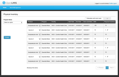
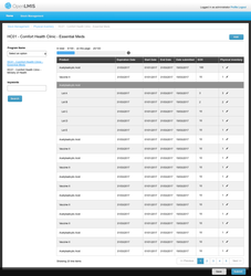
If you click 'Add' button in order to make a physical inventory for those orderables do not have stock cards yet:
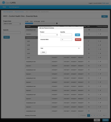
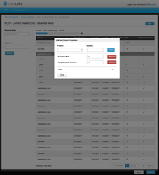
You can search with keywords:
Feedback from Team ILL:
- The progress bar should remain on top here.
- The Program Name dropdown is not needed here (we believe once you are inside doing an inventory, you cannot pick another program while on this screen).
- Add breadbrumbs to top of screen (see style guide).
After you click 'save' button:
If the save failed then:
Feedback from Team ILL: The styles for the red error message here have changed recently. Please use the latest UI Style Guide when you code this.
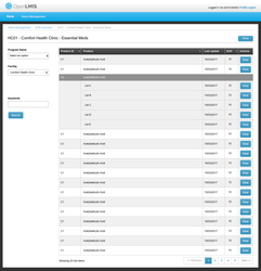
If you go back and want to view you saved draft then, You can click the 'create' button to edit the draft
Feedback from Team ILL: We do not need the "view mode" screen here to show you the view-only draft first. When the user goes into the draft inventory, they can go directly into "editing mode". Also, this screen should have the progress bar at the top.
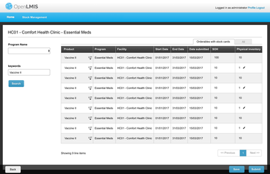
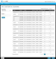
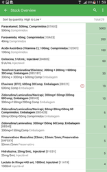
After you submit a physical inventory then it will navigate you back to the SOH summary page with the program you choose for the submitted physical inventory and your home facility:
Feedback from Team ILL:
- We suggest just showing all the Lots in this table rather than collapsing the Lots with the expand/collapse feature.
- We suggest taking off the Program and Facility fields and the left "View" button here. The Program and Facility are included in the page title, so that is fine. And this solves the problem of having two kinds of "View" buttons that each do different tasks.
The design for allowing user to choose multi-programs for one physical inventory:
The physical inventory page include lot information, already covered above
Feedback from Team ILL: Similar to above, for now we can show all the Lots expanded and not include the expand/collapse feature. Also we will need to handle the Lots in the pagination (we talked about ideas to avoid having some of the Lots paginate and get split up on separate pages).
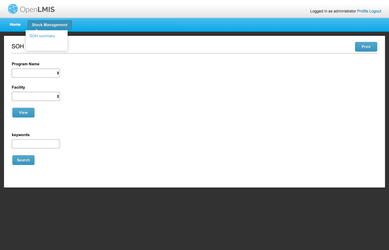
SOH summary process:
In this workflow, a Store Manager is checking the stock level for a commodity in a facility.
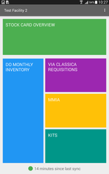
SOH menu:
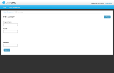
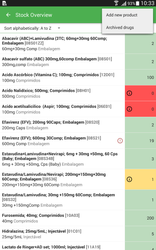
After you choose a program, facility and then click the 'view' button then:
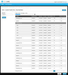
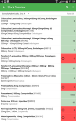
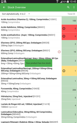
The SOH summary view within lot information
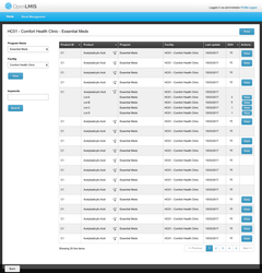
Feedback from Team ILL:
- Similar to the feedback above, we can remove the Program and Facility fields and Search button from this screen. These are included in the page title.
- We suggest adding an action button into this SOH summary table to link to making an Adjustment for any row (and product).
- The SOH quantity should sum by all lots into the top row for the whole TradeItem. So if Lot A has 5, Lot B has 10, Lot C has 2, then the trade item row should display quantity 17.
- Looking Forward: Rows that are low on stock would be indicated with color (red) or otherwise. We know the low stock calculation is not in scope for 3.1.
If you click the 'view' button next to one orderable, then it will direct you to the stock card page:
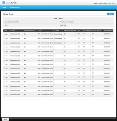
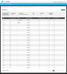
Feedback from Team ILL:
- Bin Card does not need a Facility or a Program column. The Facility and Program will be in the header at the top of the Bin Card.
- We suggest using styles from the Requisition header for the top "BIN CARD" header area. Also, please add some sample content into that header area so we are sure we are understanding what would be on this screen. Also, perhaps the Expiration Date should get a more prominent style since it is important.
Comparison Screens From Other Logistics Systems
Open question: do we treat physical inventory differently then others?
Main workflow for issues, receipts, adjusts
- Step 1: Select activity
- Step 2: Select products
- Step 3: Provide the required information to record
- Step 4: Potentially a review/confirm
Step 1: Select activity
- Option 1: 5 options (current one)
- Option 2: Stock Management (Physical Stock count, adjustments, Viewing). Receiving (normal and ad-hoc) and Issuing (normal ad-hoc)
- Option 3: Requisitions, Transactions (issues and receipts), and Stock activities (adjustments and physical stock counts)
Step 2: Select products
Once in the activity, how will the experience look. These options are not mutually exclusive and could both be there.
(to be generalized to all the other activities as well)
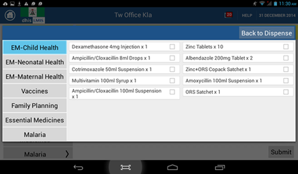
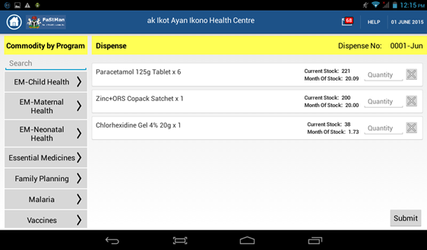
Option 1: Add products by program
The first screenshot shows a list of programs (on the left side). Clicking on a program displays the list of commodities belonging to the program, and allows the user to either all commodities (not shown here) in that program or select commodities from the program to add.
The screen says 'Dispense', but would follow a similar pattern for Adjustments as well.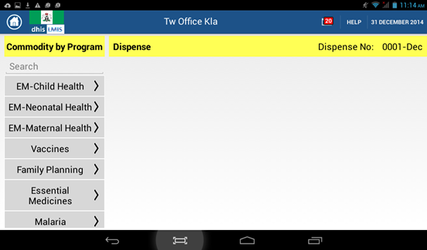
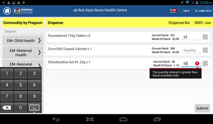
Options 2: Add products by search
Search by product name and add to page. Adding products one by one. As a sample, the first screenshot also has a search field on the top left side. Clicking there allows user to search for commodities - the screenshot below implements a predictive search.
May be useful when users don't know what programs a product belongs to. Or just adding one or two products so don't want to click through products.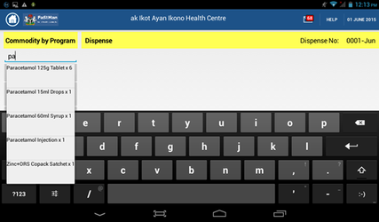
Option 3: Display all products
Display full list of products initially. Select specific products from the list or a table format where they enter the data into the columns. User enters details for the products that s/he needs to
(no mock up for this view)
Step 3: Recording stock activity details (quantities)
The following information needs to be recorded for each activity (review OLMIS-1633)
- Ad-hoc receipt. For each selected product, record:
- (required) Movement date: system generated, but might want to display on page
- (required) Received from (dropdown): this would usually be the same for all the selected products, so potentially have user select this at the top of the page
- (required) Received Quantity: user enters positive integer
- (required) Reason (dropdown): this would usually be the same for all the selected products, so potentially have user select this at the top of the page
- Others: such as document number or signature, as configured by admin in OLMIS-706
- Stock on Hand: auto-generated by system, to be displayed to user
- Ad-hoc issue. For each selected product, record:
- (required) Movement date: system generated, but might want to display on page
- (required) Issued to (dropdown): this would usually be the same for all the selected products, so potentially have user select this at the top of the page
- (required) Issued Quantity: user enters positive integer
- (required) Reason (dropdown): this would usually be the same for all the selected products, so potentially have user select this at the top of the page
- Others: such as document number or signature, as configured by admin in OLMIS-706
- Stock on Hand: auto-generated by system, to be displayed to user
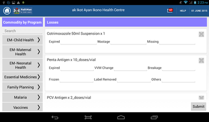
- Adjustment. For each selected product, record:
- (required) Movement date: system generated, but might want to display on page
- (required) Adjustment Quantity: user enters positive integer
- (required) Adjustment Reason (dropdown): this would usually be the same for all the selected products, so potentially have user select this at the top of the page
- Need to show based on reason whether it is a positive adjustment or negative adjustment (either by color of reason/quantity or +/- signs)
- Others: such as document number or signature, as configured by admin in OLMIS-706
- Stock on Hand: auto-generated by system, to be displayed to user
- Physical Stock Count. For each selected product, record:
- (required) Movement date: system generated, but might want to display on page
- (required) Stock on Hand: user enters positive integer
- Others: such as document number or signature, as configured by admin in OLMIS-706
- Adjustment Quantity: auto-generated by system, to be displayed to user
For each activity, need to decide what information (such as current SOH, MOH, AMC) should be displayed while the user is entering information.
Adding screenshots for recording quantities, reasons, and other information. This will likely not need a series of options but we can discuss. (Note the reasons dropdown in these screenshots are different from ours, please ignore)
An option for adjustments is to allow the user to enter multiple quantities corresponding to each reason, all together:
Patterns
Should we have more navigational hierarchy?
Open Questions
| Question | Discussion | Ticket | Status | |
|---|---|---|---|---|
| 1 | Once Stock management is selected as “on” by an implementer, can they also select which activities are “on” (i.e. choose to have any only adjustments for e.g. and record all stock management activities through adjustments). I prefer they have this ability, but open to discuss. If they can select the activities, the menu here should reflect those selections | |||
| 2 | Can admin/implementer re-order the dropdown menu? | Nick: should actually be doable technically? If the desire is to do this without code, becomes tricky. | ||
| 3 | Can admin/implementer re-group the dropdown menus? For instance, have ad-hoc receive/ad-hoc issue be part of the Receive and Fulfillment processes? Or combine Requisitions and Orders into a single dropdown?
| Nick: should actually be doable technically? If the desire is to do this without code, becomes tricky. | ||
| 4 | Should we consider the use of icons for stock management? In general, should stock management reference UI be more "advanced" than requisitions? How far can the look and feel for stock management differ from requisitions? | Nick: prefers phrases versus icons. Typically for lower literacy you'll want both. Icons can also get tricky and may not mean the same thing across boundaries. |
| Gliffy | ||||
|---|---|---|---|---|
|
References:
Facility Edition Demo photos here and here.
Mary Jo Kochendorfer (Deactivated) Lakshmi Balachandran
Attached is the example excel that TW discussed around different user scenarios of making stock movements.
stock card line item columns.xlsx
Example physical inventory
http://docs.msupply.org.nz/items:stocktakes#5items-22stocktakes
| Widget Connector | ||
|---|---|---|
|
| Widget Connector | ||
|---|---|---|
|
ESMS Mozambique Screenshots:
- Home Page
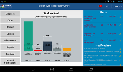
 2. SOH visualization
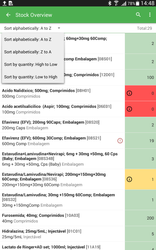
 3. Stock card and recording a movement
.png?version=1&modificationDate=1485287023643&cacheVersion=1&api=v2&height=250)
.png?version=1&modificationDate=1485287022509&cacheVersion=1&api=v2&height=250) 4. Physical Stock count
4. Physical Stock count.png?version=1&modificationDate=1485287019789&cacheVersion=1&api=v2&height=250)
.png?version=1&modificationDate=1485287020621&cacheVersion=1&api=v2&height=250)
.png?version=1&modificationDate=1485287021650&cacheVersion=1&api=v2&height=250)
Nigeria Fastman screenshot: Home page (more screenshots embedded in the story above)