...
- At the top of this dashboard, we have a filter box accompanied by the Logistics Summary Report which shows data on the stock levels at the start and end of the reporting period, consumption, receipts, adjustments, and ordered quantity
- As with other dashboards, we included the reporting rate and timeliness pie chart and table so that users can understand the denominator of facilities included in this table. These can be removed. Relatedly, the filter box can be adjusted to to include a parameter for reporting timeliness as well
- Consumption report which shows the total consumption and the adjusted consumption per product. Note that a filter for a particular facility and period should be applied, otherwise this report will show an aggregation across multiple facilities and periods. There is a banner on the dashboard flagging this as well
- Line chart showing the total adjusted consumption per facility. Note that in this case a filter should be applied for a particular product, otherwise it will return aggregations across all products. There is a banner on the dashboard flagging this as well
Orders
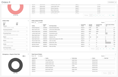
- The top of this dashboard contains the pie chart and table for reporting rate and timeliness for the reasons as discussed in other dashboards above. It can be removed easily
- Detail table showing the quantity ordered, quantity received, and fill rate (received / ordered * 100) for each product, facility, and processing period
- Pie chart showing the % of orders that are regular orders versus emergency orders
- Detail table showing the total cost of orders for each facility (blank in screenshot as we did not have cost in the demo data we used)
Adjustments
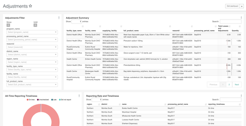
- Detail table showing Adjustment Summary Report which includes the total losses and adjustments per facility, product, and processing period, accompanied by reason. Currently it just shows the reasonId because the demo data we used did not have reasonName, but this can be adjusted by JOINING to a table with reason names and updating the chart
- Includes reporting rate and timeliness info but this can be removed
Administrative
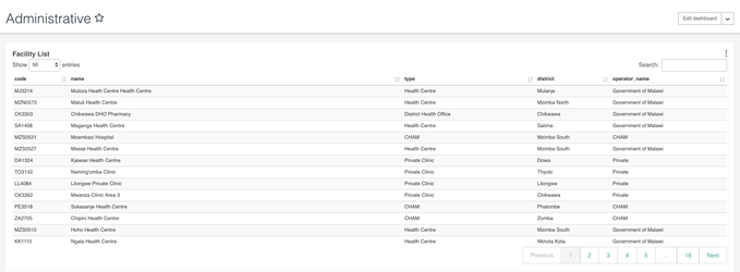
- List of facilities with their code, type, operator, and district. Phone number or head of staff can be included, but this information did not exist in our demo data
References
DHIS2 LMIS module UI
...