...
| Process | Ideal View | Idea | Notes |
|---|
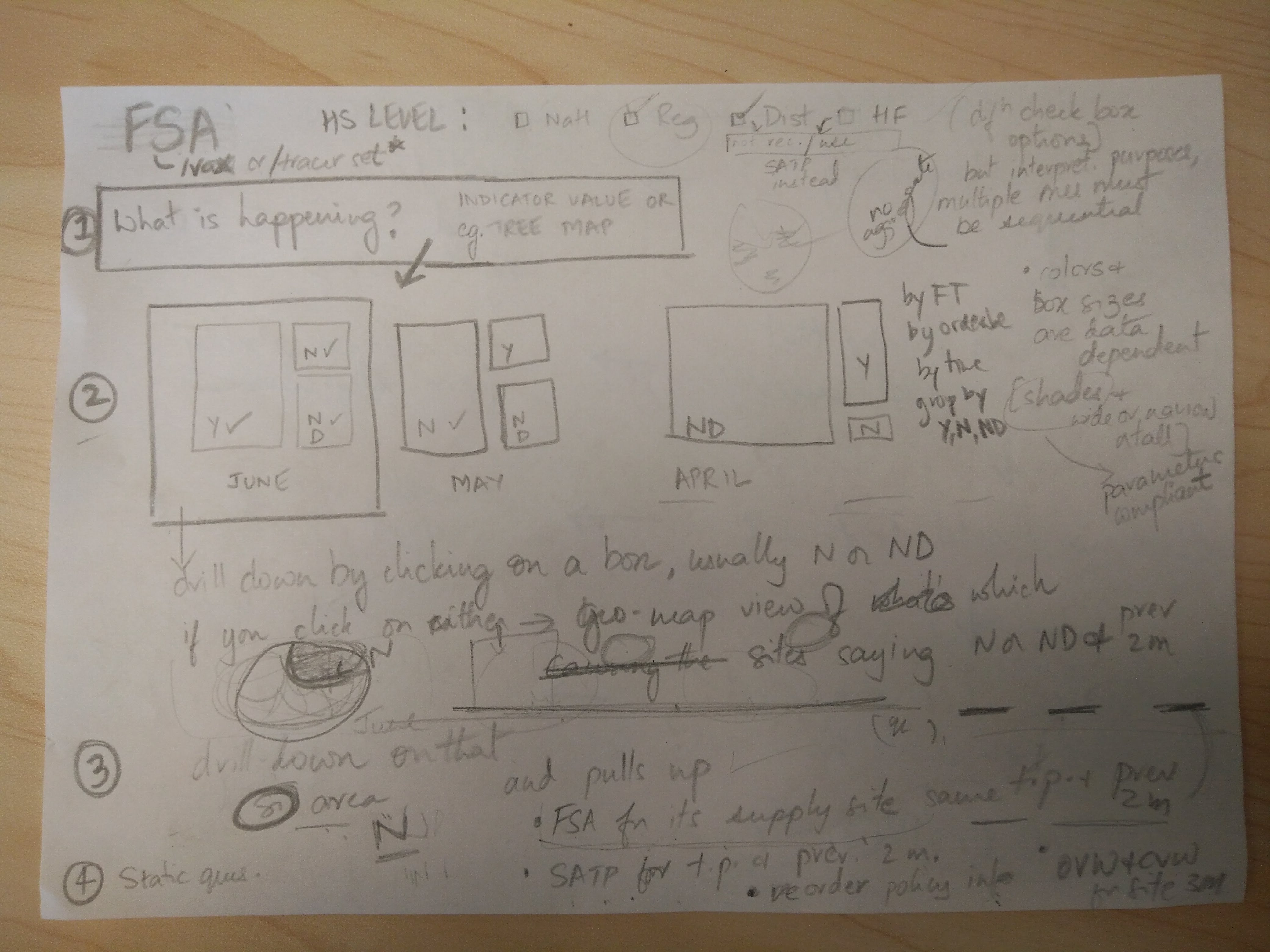
- What is happening?
| visual / at a glance should illuminate the RISK right away | Idea: Start with a Tree Map View Groupings for the Tree Map View - FSA "Yes" grouping only is yes if all the selected orderables are available during the selected time period at the chosen facility(ies) - label this grouping "Vx Available" in the tree map view.
- FSA "No" grouping is if any orderable selected is stocked out during the selected time period at the chosen facility(ies) - label this grouping "Stock-outs" in the tree map view.
- FSA "No Data" grouping if any orderable selected does not have data during the selected time period at the chosen facility(ies) - label this grouping "No Data" in the tree map view.
Filter the Tree Map view by - Facility type
- by commodity type (antigen)
- by time period
Idea: There is too much noise if a user selects several antigens and so the bulk of the tree map ends up showing "No" and "No Data" and over-plays the risk as a result. One way to work around this is to display either a simple bar chart which shows antigens with the highest number of sites with no stock or a bubble plot showing 3 variables (antigen, # of sites, # of days out of stock) |
|
| 2. What data is driving that state? | Drill-down ability from step above | When you click on a box in the tree map in Step 1 above, it shows you the data that is contributing to the box. This data can be visualized in the form of a geo-spatial map. Let's say you selected the "No/Stockouts" box in the tree map in Step 1. When you select it, it then shows you a map that highlights the stocked out areas that contributed to the "No" box for the tree map. Key is to be able to see the 'worst offenders' over time by seeing the drill-down for the selected time period, and the visualization for the two previous time periods to pull out patterns of performance. This gives the user the opportunity in Step 3 below to "Focus" in further. |
|
| 3. Where should I focus? | Ideas: - A user selects the site from Step 2 above that has long-standing issues
- show related indicators at that site
| When at the site view: Show the following: - CVW
- SATP
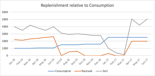
- See consumption (example below)
- FSA of the supplying site for the most problematic facilities (for the same time-period and further back)
- Pull in other indicators for that site (Stock according to Plan, CVW)
- Re-order information with use information
|
|
| 4. How can I improve that? What questions do I ask? What corrective actions should we take? | static , suggested RCA questions to ask at the bottom Vidya Sampath to provide the RCA probes and action suggestions for each indicator | Static questions for FSA RCA: - Is there a link between availability of vaccines and supplies at this site and the parent site(s)?
- If yes, what can I do about the re-order practices between this site and the parent site? Is the order request calculated accurately? Is the order fulfilled as requested? Were deliveries or pick-ups delayed often?
- What is the impact of low availability at the national and regional stores on sites lower down the health system?
- Are certain sites full availability lower (or higher) than expected every time? If yes, what changes can we make to the amount supplied each order? By what percentage should that amount increase (or decrease)?
- If we disaggregate by location, are rural (or urban) facilities more stocked out than the other? What can we do about that?
- Is it specific antigens that seem to be stocked out more than others? What's the reason for that - increased consumption? Mass wastage due to CCE failure? Upstream low stock? Global supply shortage?
|
Other notes, need to organize:
...
Hand written notes