Simple work plan / release diagrams
Very simple work/release plan diagrams can be help to help plan and track work/scope for some feature. Creating these diagrams is usually done by someone that is responsible for delivering a non-trivial feature.
Qualities:
- These are not formal diagrams and the simpler the better. That said there is value in keeping to the same uniform format across team members.
- Boxes and lines (no bidirectional arrows, multiplicities, spheres, etc)
- Work "flows" from left to right. i.e. you read it from left to right, and top to bottom with the first scope of work near the top.
- Vertical "swim-lanes" represent units of time - usually a sprint is a good time frame, however you don't need to start with knowing the exact sprint numbers.
- Focus on the big picture capabilities (not on the fine details):
- Start from the whole feature / scope of work, and break it down. Don't go too far, usually no more than 4-6 boxes in any one sequence.
- Break it down far enough to find work that is dependent on other work (e.g. to accomplish a forgot password feature I must have the ability to send email).
- Look for work that can also be done in parallel, ignore for now whom might work on what or how many people might be available. You can refine the diagram later if need be (though it adds complexity and visual noise).
- Use color to denote varying scope or decision points.
- If the scope is really large, break it up into multiple releases - focus more detail on the immediate release, and very little on releases that are not immediate.
Example: DHIS2 interoperability

- Color denotes 2 main scopes of work: Publishing metrics and messaging to get metrics from one system to another
- Ticket numbers are used for ones that exist (so far)
- Units of time are abstract - we'll fit it to sprints later and possibly put more than one box in one unit of time vertical later.
Example: Stock Based Requisitions
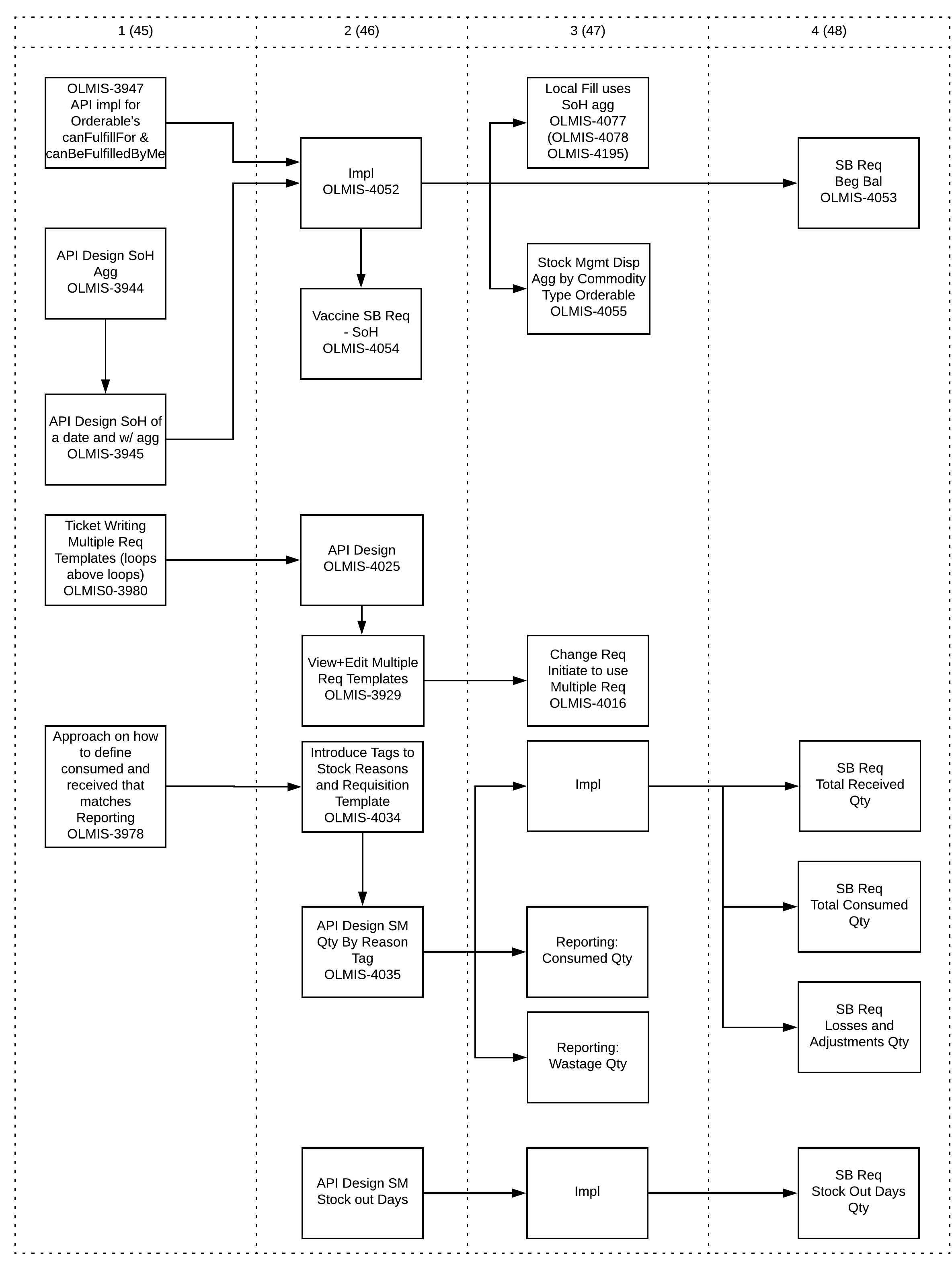
- Colors could have helped identify scopes of work (multiple requisition, stock tags, stock on hand aggregates).
- Units of time have sprint numbers next to them, some sequenced work is delivered within the same sprint.
- Diagram evolved as work progressed. While still focused on the bigger picture, the added complexity requires better visual queues to be apparent).
OpenLMIS: the global initiative for powerful LMIS software