A user interface (UI) inventory is a method of identifying and collecting variations of user interface layouts and control groupings. From the collected patterns we hope to inform an effective standardization of design elements and language. It's important to note that we are comparing the elements that make up product features, not the features' specific functionality.
This UI Inventory focuses on all OpenLMIS implementations from 3.0 Beta, V2, eLMIS, VIMS, SELV, and includes examples from each system. This report doesn't look at the overall UI-consistency between versions and modules — only examples are pulled to denote different patterns. From observations while compiling the report, inconsistency is more common between modules within a single version rather than between OpenLMIS versions.
Sections Covered
Forms
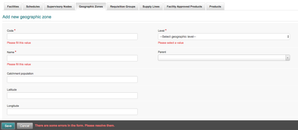
Required Field Labels
| Required Fields are Labeled | All Fields are Required |
|---|---|
| Any form field must have a required label | If all form fields are required, then no label is needed |
|
|
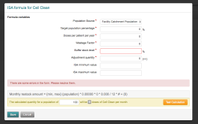
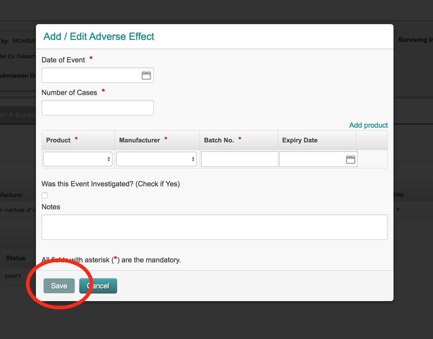
Disabled Action Buttons
| Button Enabled | Button Disabled |
|---|---|
| When an action button is enabled it allows a user to click the button and then receive error messages afterwards. This is most similar to how a traditional web forms works. | Only when all required information is entered is a user allowed to press an action button. This technique was popularized with AngularJS. Its worth noting that for longer forms, this is considered bad for usability. |
|
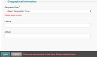
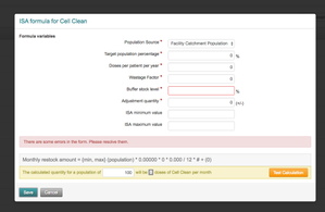
Error Message Placement
| On Field | Near Form Action | At Top Element |
|---|---|---|
| Error messages are left on the actual form field element | Error messages are shown near the bottom towards where the form action was made. | UI messages are illustrated at the top of a form element. |
|
|