...
- Stacked bar chart that shows the number of facilities with various stock levels. Note the screenshot above is not pre-filtered to look at tracer products, which is something that is commonly done for real-life scenarios. This bar chart can be filtered to return results for a single commodity, could be modified to show counts of commodities at various stock levels for a single facility, district, or region, or could be converted to return percentages instead of counts
- Detail table showing the stock status and periods of stock for each facility, commodity, and reporting period. This table is searchable and sortable
Stockouts
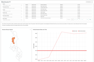
- At the top of this dashboard, we included the reporting rate and timeliness detail table described above to allow users to understand the denominator of facilities who have/not submitted for a particular period. This can be easily removed or modified to suit your needs
- Map that shows the stockout rate for all facilities and commodities within a district. Note in this screenshot above we only see one district highlighted, but this would show a color scale from white to dark red with data from multiple districts (in the demo dataset loaded into the screenshotted dashboards, we only have data from one district). Use the filter box to find the stockout rate for a particular commodity
- Line chart with a stockout rate compared against baseline. As highlighted in the text box above the charts (and elsewhere on this page), by default this returns an average across all commodities and facilities. Use the filter box to select a particular commodity and/or district
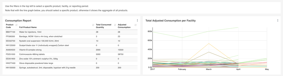
Consumption
- At the top of this dashboard, we have a filter box accompanied by the Logistics Summary Report which shows data on the stock levels at the start and end of the reporting period, consumption, receipts, adjustments, and ordered quantity
- As with other dashboards, we included the reporting rate and timeliness pie chart and table so that users can understand the denominator of facilities included in this table. These can be removed. Relatedly, the filter box can be adjusted to to include a parameter for reporting timeliness as well
- Consumption report which shows the total consumption and the adjusted consumption per product. Note that a filter for a particular facility and period should be applied, otherwise this report will show an aggregation across multiple facilities and periods. There is a banner on the dashboard flagging this as well
- Line chart showing the total adjusted consumption per facility. Note that in this case a filter should be applied for a particular product, otherwise it will return aggregations across all products. There is a banner on the dashboard flagging this as well
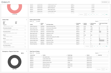
Orders
References
DHIS2 LMIS module UI
...