Dashboards
- Mary Jo Kochendorfer (Deactivated)
- Clay Crosby (Unlicensed)
- Brandon Bowersox-Johnson
Goals
- Provide users with relevant and accurate reports and metrics to make operational and supply chain decisions.
Background and strategic fit
Here are the key characteristics of a dashboard:
- All the visualizations fit on a single computer screen — scrolling to see more violates the definition of a dashboard (Note that VIMS dashboard scrolls, but with expand/collapse sections.)
- It shows the most important performance indicators / performance measures to be monitored.
- Interactivity such as filtering and drill-down can be used in a dashboard; however, those types of actions should not be required to see which performance indicators are under performing. Users could choose between pre-defined filters, "like province, program, antigen, etc."
- It is not designed exclusively for executives but rather should be used by the general workforce as effective dashboards are easy to understand and use.
- The displayed data automatically updated without any assistance from the user. The frequency of the update will vary by organization and by purpose. The most effective dashboards have data updated at least on a daily basis. Dercio suggests: "on the dashboard, it would be immediate - it's important to notice that a warning should be posted on this as the data might not be fully uploaded on to the system".
Contents (as of 3.5 release)
Below is a list of the different dashboards we built as a part of the 3.5 release of OpenLMIS. Each should be created as its own page within the OpenLMIS UI under the Reporting menu (this needs to be finished in the 3.6 release – currently in the 3.5 version we have all dashboards available under a View Reports button).
The layout of particular dashboards can be easily modified for your implementation, as can the styles of charts. Some key chart modifications are called out below, but speak with your OpenLMIS representative to talk in more detail about any questions or requests you might have.
All of these dashboards contain filter boxes that allow users to select from a dropdown list or completion match on various fields, like region, district, facility, processing period, processing schedule, and more. The filters will restrict the data returned by a chart, and without applying filters, all data is returned. Some charts are most meaningful when filtered, and those notes have been called out in the descriptions below. These filter boxes are configurable and can be updated based on your implementation's needs.
Please go here for the SQL logic used to generate the indicators and queries. Below is a series of non-technical descriptions of the dashboards' contents.
Reporting Rate and Timeliness

- Pie chart counting requisitions broken down by timeliness
- Table with horizontal bar charts showing the number of expected facilities per reporting period
- Detail table showing the timeliness of each facility per period. This table is searchable and sortable
Stock Status

- Stacked bar chart that shows the number of facilities with various stock levels. Note the screenshot above is not pre-filtered to look at tracer products, which is something that is commonly done for real-life scenarios. This bar chart can be filtered to return results for a single commodity, could be modified to show counts of commodities at various stock levels for a single facility, district, or region, or could be converted to return percentages instead of counts
- Detail table showing the stock status and periods of stock for each facility, commodity, and reporting period. This table is searchable and sortable
Stockouts

- At the top of this dashboard, we included the reporting rate and timeliness detail table described above to allow users to understand the denominator of facilities who have/not submitted for a particular period. This can be easily removed or modified to suit your needs
- Map that shows the stockout rate for all facilities and commodities within a district. Note in this screenshot above we only see one district highlighted, but this would show a color scale from white to dark red with data from multiple districts (in the demo dataset loaded into the screenshotted dashboards, we only have data from one district). Use the filter box to find the stockout rate for a particular commodity
- Line chart with a stockout rate compared against baseline. As highlighted in the text box above the charts (and elsewhere on this page), by default this returns an average across all commodities and facilities. Use the filter box to select a particular commodity and/or district
Consumption


- At the top of this dashboard, we have a filter box accompanied by the Logistics Summary Report which shows data on the stock levels at the start and end of the reporting period, consumption, receipts, adjustments, and ordered quantity
- As with other dashboards, we included the reporting rate and timeliness pie chart and table so that users can understand the denominator of facilities included in this table. These can be removed. Relatedly, the filter box can be adjusted to to include a parameter for reporting timeliness as well
- Consumption report which shows the total consumption and the adjusted consumption per product. Note that a filter for a particular facility and period should be applied, otherwise this report will show an aggregation across multiple facilities and periods. There is a banner on the dashboard flagging this as well
- Line chart showing the total adjusted consumption per facility. Note that in this case a filter should be applied for a particular product, otherwise it will return aggregations across all products. There is a banner on the dashboard flagging this as well
Orders

- The top of this dashboard contains the pie chart and table for reporting rate and timeliness for the reasons as discussed in other dashboards above. It can be removed easily
- Detail table showing the quantity ordered, quantity received, and fill rate (received / ordered * 100) for each product, facility, and processing period
- Pie chart showing the % of orders that are regular orders versus emergency orders
- Detail table showing the total cost of orders for each facility (blank in screenshot as we did not have cost in the demo data we used)
Adjustments

- Detail table showing Adjustment Summary Report which includes the total losses and adjustments per facility, product, and processing period, accompanied by reason. Currently it just shows the reasonId because the demo data we used did not have reasonName, but this can be adjusted by JOINING to a table with reason names and updating the chart
- Includes reporting rate and timeliness info but this can be removed
Administrative

- List of facilities with their code, type, operator, and district. Phone number or head of staff can be included, but this information did not exist in our demo data
References
DHIS2 LMIS module UI
After selecting a facility, you see this screen/dashboard driving the user to upcoming forms.

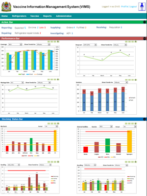
VIMS Dashboard
It has an Action Bar with timely actions you can take in the system, plus expandable sections to get bar charts with key metrics (e.g. Coverage by month, by district, by facility; Stock Status; and more):


VIMS Dashboard Design
Design documents, including the example below, are available in the VIMS Confluence Wiki: https://elmis-tzm.atlassian.net/wiki/pages/viewpage.action?spaceKey=VIMS&title=VIMS+Dashboard+Mockup:
Questions
Below is a list of questions to be addressed as a result of this requirements document:
| Question | Outcome |
|---|---|
Not Doing
Related content
OpenLMIS: the global initiative for powerful LMIS software