You are viewing an old version of this page. View the current version.
Compare with Current
View Page History
« Previous
Version 2
Next »
Overview
Nikita and Protichi are proposing designs for modifying our stock management workflow to work on a cell phone.
Resources:
To Do:
- Demo data (20 items)
- More depth in problem statement and user stories
Problem Statement
Stock clerks have the difficult task of tracking the inventory at a clinic. These clinics can range in size from a district hospital to a rural health outpost.
We have chosen to focus primarily on doing a physical inventory in the OpenLMIS system, and using that to refine the OpenLMIS-UI design to support mobile navigation and data entry.
9/17 Draft Feedback
The following feedback is from Nick Reid (Deactivated) and Alfred Mchau
Workflow Feedback
Home page I like the ideas that you included for the homepage – general web designer trick is to make the home page last, since they are usually political and hard |
|
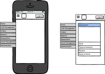
We like the navigation paradigm - Leaving space for help and instructional text is useful. Alfred Mchau mentioned that some administrators will infrequently use the program, so leaving hints is great.
- If you have trouble writing "help" copy - either write something very simple (which can say nothing "Physical Inventory is where you will do physical inventory tasks" (see how the sentence is pointless and self referential)) OR copy some text from a book (I use alice in wonderland) – NEVER USE LOREM IPSUM
| |
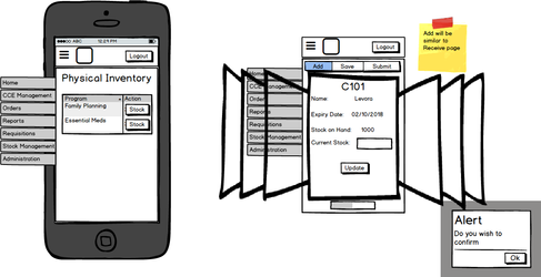
Physical Inventory - Missing from physical inventory 'index' page
- Name of facility
- If a specific physical inventory has an active draft
- Need middle screen to show full list of products in physical inventory
- Alfred pointed out that a stock room is not organized in alphabetical order, so being able to find a single product from a list of 300+ items is important. Include the free text search here
- Alfred suggested that products with multiple lots (vaccines) be grouped together, and a user should have a similar "sub" workflow here – as they will want to add a new lot that was not recorded earlier.
- When editing a single product at a time on a mobile device, we thought using buttons like "update" or "next" would make the user feel more secure that they actually changed an element. Technically, all the changes are being saved, and on a larger screen size it feels normal to skip between rows because you can see them.
- IMPORTANT NOTE: When doing a physical inventory, a user will be picking up and putting down their phone often. This means that lots of state should be visible so a user doesn't get lost. The most important aspect is if the user is done recording information and is ready for the next step.
| |
Design Feedback
This is more technical feedback about how to make a design, and is not relevant to feature development
Highlights:
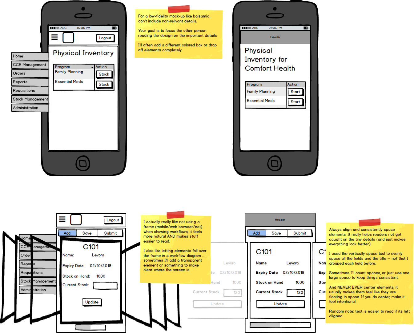
- Focus on the text on the screen, and remove any unrelated text. Keep it simple and try to be realistic – it helps keep feedback focused on the design
- Align items ctrl+left/right arrow does a 'large' space in most design programs, its helpful for making accurate spacing quick (another trick is to adjust the sizes and positions using numerical input)
- Try to avoid colors other than white, light gray, and black text. Simple pallets keep feedback focused. We do use light blue and dark red as accents.