Mobile Stock Management Workflow
- Nick Reid (Deactivated)
- Mary Jo Kochendorfer (Deactivated)
Overview
Nikita and Protichi are proposing designs for modifying our stock management workflow to work on a cell phone.
Resources:
- Balsamiq Mock-ups
- Mock Ups (some mobile and some web applications - scroll to the bottom)
- [mFlow/HCMIS] mFlow VRF Processing / Issue (District to Facility) (more on mFlow)
To Do:
- Demo data (20 items)
- More depth in problem statement and user stories
Presentation Outline:
The Product Committee meetings 9/27 at 9am PST
We will have 20 minutes to:
- Introduction and describe Summer of Code
- Describe what you have done
- SMS App
- Cordova
- Chemist
- Explain the goal of this mobile prototype
- Demo the prototype
- Ask questions to the Product Committee (because if they ask questions, the meeting might never end)
- How do we show shelf/bin in mobile UI
- What are the next steps for picking up the design work?
Problem Statement
Stock clerks have the difficult task of tracking the inventory at a clinic. These clinics can range in size from a district hospital to a rural health outpost.
We have chosen to focus primarily on doing a physical inventory in the OpenLMIS system, and using that to refine the OpenLMIS-UI design to support mobile navigation and data entry.
9/24 Nick Reid Edits
9/21 Mary Jo thoughts
- We don't use grouped products like we have in requisitions
- Navigation could use accordion/sliding menu all the way until you get to the products
- For a mobile device, its probably going to be used in a small clinic —
- How do you see the summary page so you can check your work before you submit
- What does an error message look like
- If you didn't add an adjustment reason to an item – what does that look like
- Missing Adjustment Reasons feature
PC presentation should include
- Explain what they did
- What was your goal
- What are the next steps for the community picking up this design work
9/17 Draft Feedback
The following feedback is from Nick Reid (Deactivated) and Alfred Mchau
Workflow Feedback
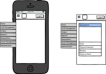
Home page I like the ideas that you included for the homepage – general web designer trick is to make the home page last, since they are usually political and hard | |
We like the navigation paradigm
|
|
Physical Inventory
|
|
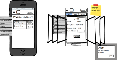
Design Feedback
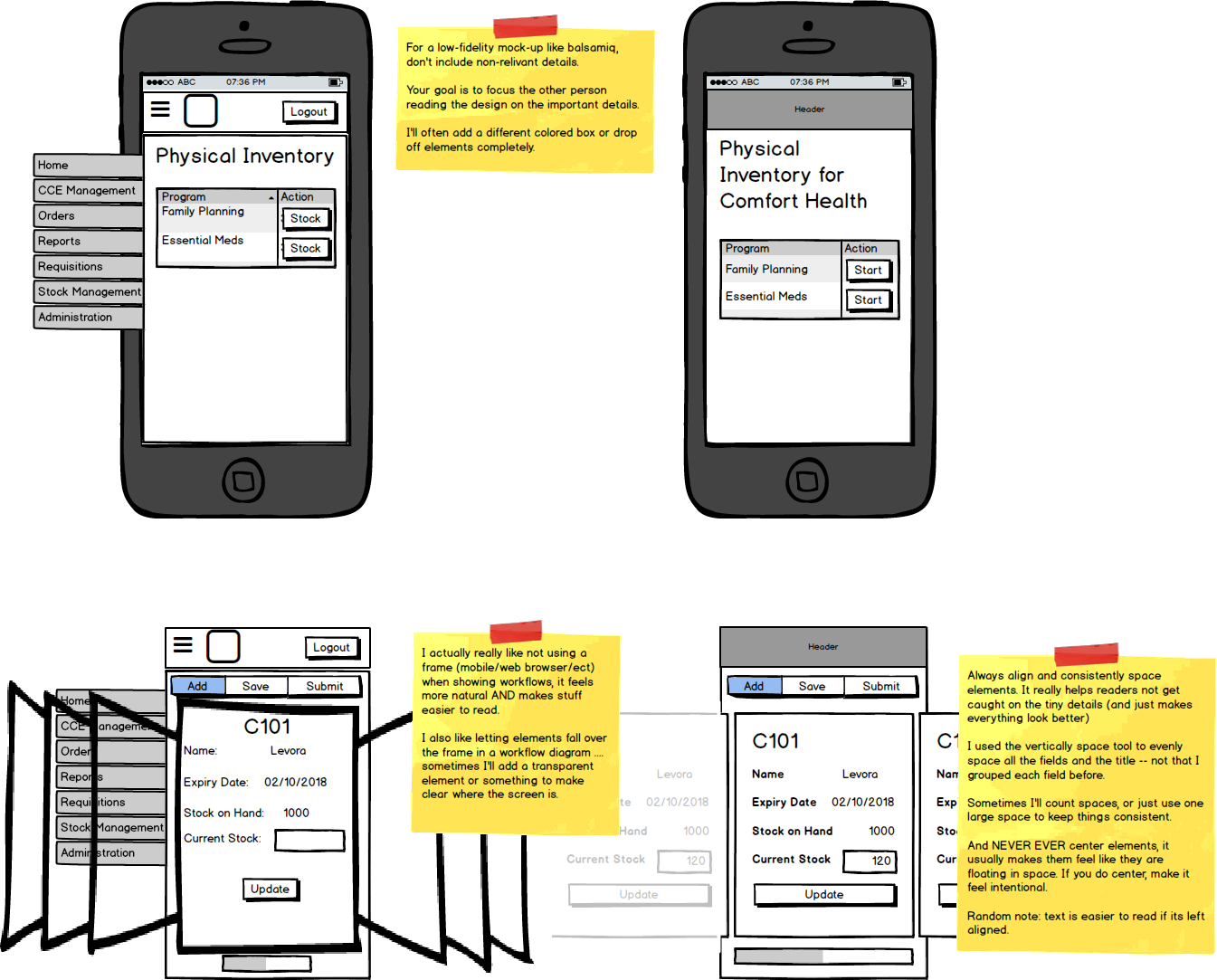
This is more technical feedback about how to make a design, and is not relevant to feature development
Highlights:
- Focus on the text on the screen, and remove any unrelated text. Keep it simple and try to be realistic – it helps keep feedback focused on the design
- Align items ctrl+left/right arrow does a 'large' space in most design programs, its helpful for making accurate spacing quick (another trick is to adjust the sizes and positions using numerical input)
- Try to avoid colors other than white, light gray, and black text. Simple pallets keep feedback focused. We do use light blue and dark red as accents.
OpenLMIS: the global initiative for powerful LMIS software