Information Architecture Redesign
This page is part of OLMIS-2955 - Getting issue details... STATUS
Problem
In the OpenLMIS-UI, users are constantly forced to filter to the facility and program they want to work in. This has caused usability issues, such as users getting lost in the system, and has created the need for duplicative code through out the OpenLMIS-UI codebase. |
Alternative Approaches
| System | Description | Screenshots |
|---|---|---|
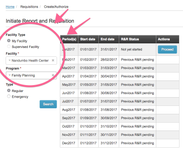
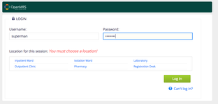
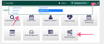
| OpenMRS | ||
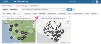
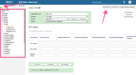
| DHIS2 | Global navigation for data browsing Data entry is navigated to by a hierarchical tree | |
| Weather.com | Locations are stored in a menu bar, where snap shots of information are displayed. | |
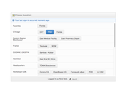
| Logistimo | Data entry is done per entity, where the entity is specifically selected. | |
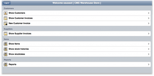
| mSupply | Seems to be a global pattern. Unsure how location/program data is entered. | |
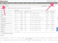
| OpenBoxes | ||
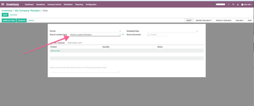
| Odoo | ||
| Media Temple | Interesting how you can change site (or facility/program) through the breadcrumbs |
Resources
These are some articles on website structure and navigation
Analysis
A driving experience in the OpenLMIS-UI is if Facility/Program selection is a facet of page filters OR a part of the information architecture.
Data entry in all systems depends on knowing which facility/program a user is inputting data for.
- For systems that don't include facility/program in their information architecture, the user is prompted to enter the facility/program.
- When a system includes the facility/program in their information architecture
Current State of OpenLMIS-UI
| Module/Pages | Facet | IA |
|---|---|---|
| Administration | - | - |
| CCE | X | |
| Fulfillment | X | |
| Reports | X | |
| Requisitions | X | |
| Stock Management | X |
Potential Solutions
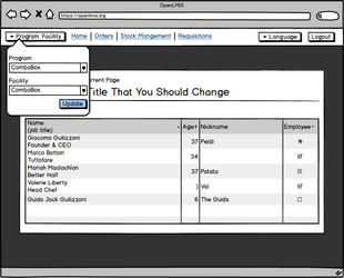
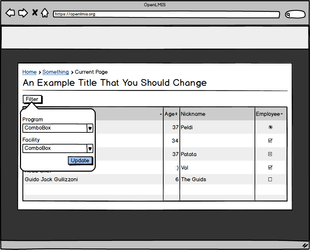
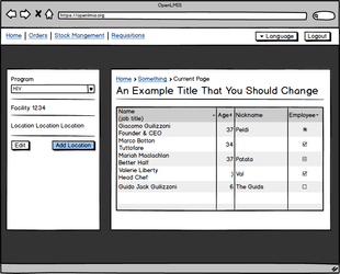
| Description | Pros | Cons | Mock-up |
|---|---|---|---|
| Facility and Program on Login |
|
| |
| Filter facility and program per view |
|
| |
| Stored facility/program selection |
|
|
OpenLMIS: the global initiative for powerful LMIS software
