3.5 Report Development Feedback Parent Page
- Clay Crosby (Unlicensed)
- Mary Jo Kochendorfer (Deactivated)
The pages linked beneath this one will hold feedback collected on the collections of reports built in Superset.
Credentials:
- URL: https://superset.ona.io/superset/dashboard/59/
- Username: OpenLMIS
- Password: demo
- Dashboard: OpenLMIS Gap Reports
Mary Jo's feedback
The following is my feedback and it is in addition to the verbal comments shared during our meeting on .
Overall Comments
- I'd like to hear more from Ashraf and Muhammad Ahmed (Unlicensed) about their experiences with improving data use and types of reports. However, I feel that the table slices are challenging to use to evaluate or analyze the data. I feel that each slice will need some context or clarity around what you should do to find useful information. For instance, the stock status has so many filters and I'm not sure what the best way is to see what I want to see. I feel like we should separate some slices for "data dumps" and use for doing RCA where a ton of filters are needed to ask questions of the data. Then perhaps a couple slices which are more visual and are only made to serve one purpose.
- It seems like the filters from one tab (i.e. stock status to consumption) hold over to the next. That is confusing...
Reporting Rate and Timeliness
- Add facility filter.
- Add a map view of the results.
- Perhaps create another slice where you only show the Did not report. I suggest this because I see the value in the current table and feel most would want to export that so they can see more than 10 facilities at a time.
- CSC comment: I made it paginated and added a filter to the left for stock status, so this can still be done by just applying a filter on status for the single table and exporting
Stock Status Tab
Overall I think the visuals are nice but I had a hard time going between them with the filters. Certain slices yielded better results with different filters. For instance, count of facilities will not be useful if I ever select one facility. However, if I select one facility the table (stock status and imbalance report) is useful. I look forward to comments from others around suggestions or their impressions.
- when we finalize, I think we should always program in default filters. It will help filter the relevant information and still allow users to modify/update filters. Is there a way to make the defaults dynamic? Or can users set their own by user?
- CSC comment: users can set their own by user and save custom versions of the dashboard with their filters applied. I'm not sure how that works when doing it through iFrames. Note that row-level filtering will do a lot of work when it comes to making the data view specific to the user's field of inquiry.
- One issue with the table is that you will not be able to chronologically sort the table by Processing Period because it isn't based on dates but the name of the label. (i.e. all Aprils group together). Any thoughts how to improve that?
- CSC comment: I made it sort by processing_period_enddate in the background, so now May2017 is at the top of the table. I also paginated the table so it returns more data than the 250 max by default
- The stock status filter seems to be visually cut off.
- CSC comment: fixed
- I'm not sure the filter for facility is useful for the visuals (map and bar graph) for Stock Status. the bar graph is a count of facilities. Or is the need for that filter just for the table?
- CSC comment: we could remove the filter and use the "search" function to filter the table. Alternatively, we could split them onto separate tabs
- Stockout Rate % - there seems to be something funky happening (see the bottom with the 2 x-axis):
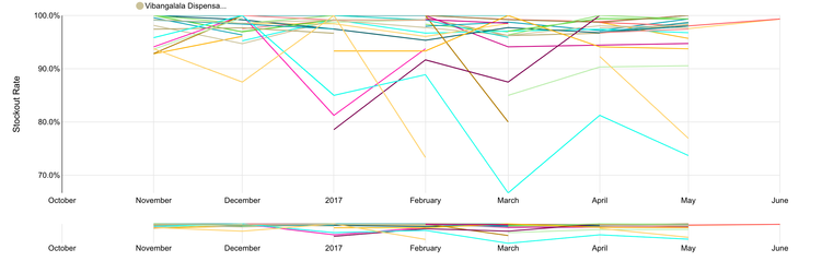
- CSC comment: I can remove that bottom line graph. What it does is allow you to adjust the graph to select a particular time frame that's smaller than the default. I removed this
- I couldn't figure how which filters to use to make the stockout rate meaningful....If I select two products is it averabing the stockout rate? Unclear what rate I'm looking at.
- CSC comment: yes, it averages them. I agree this is maybe better at a district-level, where it will be the stockout rate of that district for all facilities within that district. Then applying a filter for a particular product isn't going to give you a graph that's only 100% or 0%. We only have one district in our data so I built it this way. The TZ people liked the idea of a district-level and region-level line graph for this.
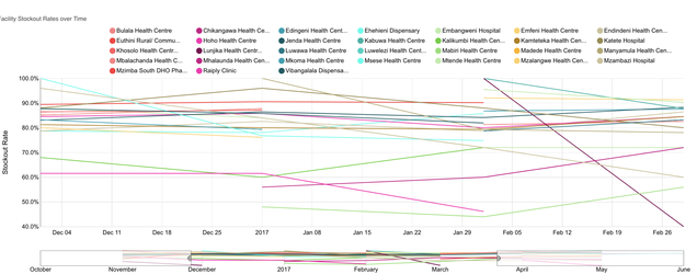
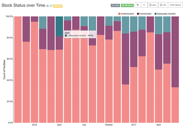
- I like the Stock status over time bar chart (when the right filters are selected to make it meaningful). I do know the next question will be which facilities so I see the value of the table alongside it. However, the table is challenging to use since the table shows results back to April 2012 but the chart does not. If I sort based on stock status the list is too long to see them all.... Not sure I have an idea to make it better but wanted to share some of the challenges.
- CSC comment: another idea that we had today with the team in TZ was to adjust so that it returns a %. This way you can filter it to a particular facility and see the breakdown of how its products or stocked, or filter to a particular product and see how the facilities break down within a district. You can just scroll up to the previous table to get the list of facilities like you describe, I think
- `
- `
- CSC comment: another idea that we had today with the team in TZ was to adjust so that it returns a %. This way you can filter it to a particular facility and see the breakdown of how its products or stocked, or filter to a particular product and see how the facilities break down within a district. You can just scroll up to the previous table to get the list of facilities like you describe, I think
Consumption Tab
- Why is there only two products in the consumption tab?
- CSC: fixed that
- Processing Period Name selection is a bit strange since it isn't sorted chronologically.
- CSC: I don't know if we can get around that. I will investigate more
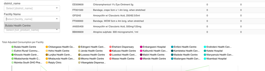
- The filter doesn't seem to allow me to select any facility other than Balaka. However, clearly there are more facilities in the Total Adjusted Consumption per Facility graph
- CSC: fixed that
Related content
OpenLMIS: the global initiative for powerful LMIS software